Neil Tunnicliffe Posted March 24, 2006 Report Share Posted March 24, 2006 Alright guys. Got my self my own web site at last! Just kept it simple for me at the moment. Hopefully I will update alot more as I have my own site now. There is not a great big deal on there yet! But I will update it all very soon! Hope you like it. Enjoy..http://www.NeilTunnicliffe.comcheers dudes!Neil.. Quote Link to comment Share on other sites More sharing options...
Deonn h Posted March 24, 2006 Report Share Posted March 24, 2006 Awsem ....finally (Y)Really gd nice and simple also Got some mega pics there niel.New vid soon?ThanksDeonn. Quote Link to comment Share on other sites More sharing options...
Simon Posted March 24, 2006 Report Share Posted March 24, 2006 Why didn't you use Brendans design. Well, where to start.The first thing that jumps out is the Times New Roman font. Please, before you do anything, change that. Tahoma, Verdana, Arial, just 3 various fonts that would like perfect.Why is that navigation block thing on the left so far down, and why does everything load with a good 200px empty space at the top? Looks like its broken rather then a design feature, which i guess is what you was going for.Then, you've done something which i've already gone over today. View this image, and now look at it on your homepage. Regardless of what width and height you put in, it will load the whole image as that size, then resize it on the fly. Not only does it make the image look shit because it doesn't process it or anything, so all the lines become a mess, as does the general quality, but it takes ages to load.You've also done the same for the navigation buttons, which makes them look really, really bad.Same for the links page, this is the image it will load, and when you've set the widths and heights, you havn't kept the right proportions, so it looks really bad.Nice concept, badly executed. Fix some of those things, mainly the font and re-size the images yourself, not using width=" " height=" " in the <img> tag, and it will be much better. Quote Link to comment Share on other sites More sharing options...
JT! Posted March 24, 2006 Report Share Posted March 24, 2006 A chain link for the link's link.Anyway, big mistake putting your msn on your site. You'll get dozens of pre 14 year olds adding you telling you they just learnt to back hop, and asking weather you got [insert random part here] for sale.Good site though Quote Link to comment Share on other sites More sharing options...
Neil Tunnicliffe Posted March 25, 2006 Author Report Share Posted March 25, 2006 (edited) Yeah simon I no what you are saying. Fixed! Respect! Neil. Edited March 25, 2006 by Neil Tunnicliffe Quote Link to comment Share on other sites More sharing options...
Ben Geary Posted March 25, 2006 Report Share Posted March 25, 2006 Really nice, very easy use. Quote Link to comment Share on other sites More sharing options...
yoyoyo Posted March 25, 2006 Report Share Posted March 25, 2006 I like it, especially the pics. Good going. Quote Link to comment Share on other sites More sharing options...
Biff... Posted March 25, 2006 Report Share Posted March 25, 2006 Niceone neil the site is pretty sweet, could do with a few more pics banging in there in the near future Quote Link to comment Share on other sites More sharing options...
Dan@Trials-uk Posted March 26, 2006 Report Share Posted March 26, 2006 Nice site you Dog face:P I can smell some proper sick stuff comming out soon;) Quote Link to comment Share on other sites More sharing options...
CBProductions Posted March 26, 2006 Report Share Posted March 26, 2006 Nice and simple , clean and easy to navigate. I like it , lets see more content Just out of curiousity when it says bike ridden in your name thing why is it mod ? Quote Link to comment Share on other sites More sharing options...
billocks Posted March 26, 2006 Report Share Posted March 26, 2006 your site is mint,simon...you dont need a flshy site when your as good as this guy,his riding does the talkin not his site, cant wait too see some more pics and possibly a new vid cheers,bill Quote Link to comment Share on other sites More sharing options...
Neil Tunnicliffe Posted March 26, 2006 Author Report Share Posted March 26, 2006 I'm not sure why it says mod in my name lol Yeah I recon a video soon too I was thinking of putting a clip/short vid page on? so i can do short video or clips as well as full lengh videos? not sure yet. Thanks for replys...... Neil.... Quote Link to comment Share on other sites More sharing options...
Clarky Posted March 26, 2006 Report Share Posted March 26, 2006 Nice site tunni Quote Link to comment Share on other sites More sharing options...
Monty_susanne Posted March 26, 2006 Report Share Posted March 26, 2006 A chain link for the link's link.Anyway, big mistake putting your msn on your site. You'll get dozens of pre 14 year olds adding you telling you they just learnt to back hop, and asking weather you got [insert random part here] for sale.Good site though Yeah can agree with JT there.big misstake. but whatever!Love that site simpel and nice dont need more. //Suss Quote Link to comment Share on other sites More sharing options...
Clarky Posted March 26, 2006 Report Share Posted March 26, 2006 It says you have uploaded zoo video 26 and 29 but i cant download 29 because it says no direct linking.Clarky Quote Link to comment Share on other sites More sharing options...
Neil Tunnicliffe Posted March 26, 2006 Author Report Share Posted March 26, 2006 http://tv.isg.si/site/?q=filebrowser/Nezza That may work Laters. Neil. Quote Link to comment Share on other sites More sharing options...
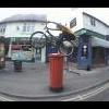
mavic Posted March 26, 2006 Report Share Posted March 26, 2006 Neil mate got a plan, telephone box, tap to hook?, want too see that please . Nice site man nice and clean.Dan. Quote Link to comment Share on other sites More sharing options...
mr ailsbury Posted March 28, 2006 Report Share Posted March 28, 2006 Neil mate got a plan, telephone box, tap to hook?, want too see that please . Nice site man nice and clean.Dan.shouldnt be too hard for him to do lol nice site man nice and simple to use and looks pretty cool Quote Link to comment Share on other sites More sharing options...
RicH_87 Posted March 28, 2006 Report Share Posted March 28, 2006 resize pics before you upload them,other than that nice one, good effort. Quote Link to comment Share on other sites More sharing options...
EngageClothin Posted April 1, 2006 Report Share Posted April 1, 2006 i like it, nice one dog face u fat slag. kiss kiss poo face Quote Link to comment Share on other sites More sharing options...
An_toin3 Posted May 17, 2006 Report Share Posted May 17, 2006 Don't know if anyone has noticed, but Neil has done an update to his site ! Go check it out ! Looks pretty good Quote Link to comment Share on other sites More sharing options...
Biff... Posted May 17, 2006 Report Share Posted May 17, 2006 Yeah i noticed this yesterday, looks pretty kool Quote Link to comment Share on other sites More sharing options...
MikeCottTrials Posted May 17, 2006 Report Share Posted May 17, 2006 Does anyone know when he will be releasing another vid, ihavent had a tunni fix in so long Quote Link to comment Share on other sites More sharing options...
Clarky Posted May 17, 2006 Report Share Posted May 17, 2006 YEah the site looks whay better now, i wonder when his next vids coming out.Clarky Quote Link to comment Share on other sites More sharing options...
Ben Geary Posted May 17, 2006 Report Share Posted May 17, 2006 (edited) Looks much better i think, one thing though ... get to Leicester you fanny it's just the best you know it is Edited May 17, 2006 by Ben Geary Quote Link to comment Share on other sites More sharing options...


Recommended Posts
Join the conversation
You can post now and register later. If you have an account, sign in now to post with your account.