Bronz
-
Posts
1809 -
Joined
-
Last visited
-
Days Won
3
Content Type
Profiles
Forums
Gallery
Everything posted by Bronz
-
♥ I wish that hadn't ended, you guys look like you have so much fun when you ride
-
I've heard your bleeds are really shit, so can I have a bleed off you to see if they're shit? I'll then proceed to be highly pissed off and slanderous if they are indeed shit.
-
This thread does seem to have gone a little box-over-chuff. People are giving you a lot of stick and you do sound like you know what you're on about, but seriously; you keep saying that ‘Oh I heard these brakes are shit so I bought one and I'm annoyed cos it's shit’. ‘People in general should not use echo brakes’ <- you've answered your own question.
-
Oh wow, this actually held my train up yesterday, but the rumour was that it was a suicide I was coming back from a ride in Manchester and this happened moments before the train was set to get to the scene of the incident (I'm assuming the train in front was the one that was involved in the incident). Tragic
-
If you know that so many of these brakes are known to leak or be faulty from the get go, why do you bother buying them?
-
That was awesome, really didn't last long enough And props also on using the coolest song ever in the world to open with, love that tune
-
Put my new site live on Saturday night. Still needs its content adding, but thoughts…? http://harryroberts.co.uk/
-
Just a little something I'm working on: http://www.dribbble.com/shots/20774-HarryRoberts-co-uk
-
To be honest you sound like you're trying to run before you can walk. Just enjoy riding at the moment and worry about sponsorships if and when when it comes to it.
-
No worries dude And I am. I kinda run my own stuff all day, I watch trials videos while my boss sits next to me. It's a pretty sweet set up
-
Dell's corporate font, Jos Buivenga must be chuffed
-
http://csswizardry.com/sturner.ai
-
Hmm, well I'm by no means a logo designer, but my quick (15 mins) thoughts:
-
Hmm. See I think it's the opposite. Very nondescript and boring. No personality. You can get some awesome free fonts though. This guy is great: http://www.josbuivenga.demon.nl/ Yeah a lot of people overlook kerning etc. It deserves some time spent on it.
-
*cough* Grammar Part of the 'requirement' of being a full member is the use of well formed sentences, including—but not limited to—the correct use of full stops. As he didn't, I opted not to submit a validation vote. Sorry…
-
Hmm, if you're going to go for an all-type logo I think a better face is needed IMO. Perhaps Din, which is kinda similar, but nicer. Also, look out for your kerning. And finally, the colours. Try shying away from the bold hyperlink-blue, and try something more subtle. My mate's an excellent logo designer, so maybe try get some inspiration: http://www.euanmackenzie.com/c/logo-design-portfolio/
-
If you go in and out of London frequently then register your car as a mini-cab. It costs like £27 a year (plus an initial registration fee) and you can come and go as you please. £27/yr vs £8/day…
-
Didn't get a vote off me as I ran out of breath part way through reading it. Full stops, use them.
-
For mine I wrote out a list of bullet points about what I can do/offer and then just formed it into a paragraph. And remember; get rid of half the words on each page, then get rid of half of what's left.
-
I probably would, yeah. Also, as an aside, head here: http://www.d2ddesign.org.uk/wp-admin/options-permalink.php and select the 'Month and name' option
-
Sure, go for it. I'll be interested to see it
-
I'll licence it to you Yeah sure, go for it (as long as it's not a total rip, of course )
-
To be fair I don't know any JS whatsoever, although if it was a case of the JS was pulled in before the divs were rendered then you can actually just place JS links at the end of your document before the closing body tag. What this does is makes sure all the HTML elements are rendered before any JS gets called and therefore executed.
-
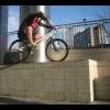
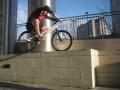
I wasn't gonna go out riding tonight, but I think I am now The music I wasn't too keen on (but that is personal preference). The riding however was great, smooth and big (ooh, err). Love it
-
Yeah definitely, I'd rather have wasted the ~£20 getting them made than lose my job haha.