

rathergoodpie
-
Posts
676 -
Joined
-
Last visited
-
Days Won
9
Content Type
Profiles
Forums
Gallery
Posts posted by rathergoodpie
-
-
alright is this still going?? do you have any other bits with it??
Yeah its still available. I have some other bits and bobs for sale in my other thread including some black fatty forks etc
http://www.trials-forum.co.uk/index.php?showtopic=147562&st=40&gopid=2104759&#entry2104759
-
You've got me doubting myself now... anyone confirm or deny the allegations of a 14" version of the Ashton replica frame?
I thought he was saying on the London ride last year that he didn't keep any of them (though he wished he had). Or was that just the blue proper signature ones rather than the red Beast of the Easts?
Are you suggesting I kill Martyn for it?...
Yeah he said he doesn't have one any more. Thought he was going to steal mine at one point!

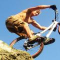
Props to Fatmike for the photo
-
-
You want a vector file, so really an eps file would be fine.
I havent used helvetica, though it is a variation on it called "coolvetica", although theres nothing wrong with it, its a great modern font. Though I much prefer Avenir, Ahoy ahoy typography nerds, unite!
Good call on Avenir, nice typeface that, particularly the uppercase.
-
Lets do the happy dance. With singing.

-
lol
As I said, probably not what you intended, but thats how you were coming across. Apologies if I got your back up.
-
C'mon, dictionary definitions? Seriously?
-
Rite...............touch dramatic that don't you reckon? It was a response to Bronz, so it wasn't for you nosey! Also it's not for the topic started either. I've contributed a couple of bits for him - i'm not trying to teach him anything - nor did i intend him to read my last post as it wasn't written for him.
What exactly can you see through my love? Also if you're not after a ''f**king essay'' - don't read it. Also, loved your ending about me trying to show off which you quickly super-seeded by telling all the typefaces country of origin.....not trying to show off are we?
...Or perhaps I was being Ironic

Anyways, just saying seemed a little ott reading your posts thats all, you know exactly what I mean. Actually quite like the design. You are writing on a forum! How can you say I'm being nosey! Kinda misses the point of a forum.
Nuff beef anyway, was just pointing out an observation.
-
Yeah, i know the spelling is way off - also i appear to have typed (what would have been as misspelling) more misspelt than intended.
I've not seen the Helvetica documentary. I've only once very briefly ever heard it mentioned. I can imagine what it may well be like though.
Yes there is nothing wrong with the typeface, and of course elements such as tracking, kerning, leading etc are all available tools which often get forgotten or mislaid along the way to finish a piece of design. I agree that the lack of effort put in by many designers doesn't help with my opinions/thoughts towards Helvetica - but that isn't really the reason i'm not in favour of it. It just does nothing for me - which i guess is its intention. I'm glad it's here and all that, and often its very useful - but for forward thinking contemporary graphic design i think there are many more options. Leave Helvetica for health and safety signage.
I think what annoys me about Helvetica is that obviously its a straight-edged, non-descript, say-nothing typeface but when i look at it, its like the 'R' is trying to show off........ ''i'm going to kick-out baby - screw you guys'', kinda thing. And the B always looks pregnant and lazy. I just find it hard getting past the American Apparel thing.
You're right its up to the designer to use their skills and ability to work with a standard or start point to avoid cliched work, but i guess i'll just always learn towards a different starting point. But like i've been saying....thats just me, and i have to live with me!
No offence, but with every post of yours I read in this thread you are becoming more and more pretentious. Stop trying to impress people with your knowledge of typography because I for one can see right through it.
He just wants a logo doing not a f**king essay on the pros and cons of post-modernist swiss letterforms.
-
Awesome vid, although of all the Limp Bizkit tracks - c'mon!
Loving the sidehop 90 degree thing, and the sidehops over the barriers without any hops that was smooth as hell.
You know its ridiculous, because stuff always looks smaller on film than in real life... and none of that was small!
Rob
-

Thats the beast of the east frame, I think later after that Aston was riding a much more trials orientated frame. I have loads of pics in an old MBUK mag, but I do not think Canondale ever made the frame he actually rode with the better geometry?
Just found this pic of the frame I am thinking of, looks like it has much more clearance than the one that was posted before.

That was his old frame but just re-sprayed I think. But yeah, the one that he rode had custom geo different to the production bike.
I think Lance Trappe rode a slightly different geo bike too.
-
Could be way off here but I remember there was as few versions of the replica frame. The one pictured above is the taller one, which I think was basically a re stickered Beast of the East frame? As the years went on the lowered the top tube on them?
Don't quote me on this but I'm pretty sure there was only one version. But yeah, does look quite tall in that pic!
-
Some of those are listed in my above post but heres a quick list...
Headset - I think it was a WTB headset
Stem - not sure, possibly CODA
Bar - Azonic Double wall / Pyramid
Grips - CODA
Seatpost - CODA
Saddle - Volvo Cannondale / CODA custom. (very rare!) he did use a Selle Italia Flite seat on later models though
Bottom Bracket - Unsure, probably shimano
Chainset - CODA running with SRAM gripshift / mech
Wheels - Mavic D521 (possibly ceramic) on Hope XC/Mono with IRC KUJO tyres (radially laced front wheel)
Brakes - Magura raceline yellow with custom booster (the one without the holes which was slightly wider)
Bashguard Filthy ard guard (think Leon on here has a black one for sale)
If I think of anything else I'll give you a shout.
Hop this helps.
I obviously spent too long gazing at the pages of MBUK when I was younger.

Rob
-

Built up this little gem a couple of years ago.
Good luck coming across one of those volvo Cannondale seats, they are mega rare! This build has the original Coda grips too. I'll do some sizing up when I get a chance and get you info on the bb etc. Unfortunately I sold the blue Fatty forks it came with and have probably been promptly re-sprayed (they don't match a lot of new trials frames!) I think the groupset on Ashton's original was all sram with coda cranks if IIRC. Im running the azonic double wall bars too, pretty sure thats correct.
Will get some better pics soon.
Also the wheels are mavic d521's on hope mono hubs (pretty sure this is what Ashton used to run) I think he used IRC Kujos as his tyre choice. I rekon ebay is your best bet for most stuff.
-
I'm running one of these in 36 hole on the rear and its a great mix of strength and lightness. Bit pricey though.
http://www.tartybikes.co.uk/product.php?product_id=10449&category_id=43
Rob
-
...and to anyone who can't see that Danny's riding trials (oh noes, other influences too?!)
- 180 degree wallridey tap thingy to wedge before hopping across a set of bike racks
- Up to rail to MASSIVE drop
- Up and over rails throughout (usually with a bit of a spin in there too which surely makes it harder?)
- Riding along a sketchy spiky fence
- etc etc etc
Seriously, don't drag the guy down for having fun on a bike and adding to the moves he does. Trials is about getting from A to B in a certain way, tackling whatever obstacles are there too. If he can throw in a spin or a flip along the way then fair play to the man!
Danny's done a huge amount for the public's view/knowledge of trials, be happy for that and do the same. If someone asks questions or asks you to move on, be polite, explain to them what they're asking or respect their wishes and move on. If you're an idiot to someone they'll think we all are, but it works the other way too.
Don't hate, celebrate.
+1 Well said that man
- 180 degree wallridey tap thingy to wedge before hopping across a set of bike racks
-
Right I have an old Giant Hawyes replica you can have for £30, its even got half a set of race face cranks on it. Its yours if you want it.
Its this one with the sprayed black front end.

-
Ok props to you Mark, I stole your gag. my bad!
Bizarrely enough "combine" would be a much better name as the 24 is a combination of the two (26 / 20) maybe the name got lost in translation? And it has added bonus agricultural reference which we all love.

-

Gota similar setup on mine too on the advice of Stan and Ali - good call boys, good call. These onza stems with the high rise trialtech bars are really nice.

-
Ha Ha, Hmm Bigman is sponsored by rockman and I'm guessing the name MUST have been something to do with him!
bloody Tractor ha genius
Rob
-
Looks cool that, loving the pixelated effect.
-
Yeah don't bother with these frames they ride like shit. Stupidly low bb. If you are looking for an old skool trials frame go for an old giant or Ashton replica, mabe a pace frame if you can find one. Theres always the old zebidis too.
-
Ok, so plan is to maybe spray this weekend. Gonna go with the peppermint green.
-
And you could do the bars to match.
I saw some guy once who had a white inspired and just flecked it with paint like a jackson pollock painting. Did the bars aswell and it looked amazing.
Quite a deep cream i guess you're thinking of?
Yeah I think Im gonna have to do a couple of new photoshops this eve


Respraying
in Trials Chat
Posted
Any ideas where Boon might have got the paint from? Or did curtis spray it themselves?
Cheers