AndyT
-
Posts
1570 -
Joined
-
Last visited
-
Days Won
22
Content Type
Profiles
Forums
Gallery
Everything posted by AndyT
-
AMAZING :) :D :S :S
-
I would at least fix the tracking on Sam holmes design before you put that into print
-
fantastically fun vid :angry:
-
f**k me i thought he was going to go to those 3 logs!! Massive! The sidehop to the booth wasn't small either <_<
-
just threw some ideas around on my lunch break, let me know what you think... (don't think you areinto this gothic style, but i used it more for a t-shirt): the shirt (all original imagery, left over from a previous project...sorry about the watermark if you want one without it this is all vector so any size is possible and its easy to print- screen and digital): wow that image automatically resizes...this was huge a little bit ago. same with this as well, about 2/3rds the original size and quality jpeg: Again this is only a little over an hours work, let me know if you like anything. I usually put in a few days for logos but then again I charge a lot more than pads <_<
-

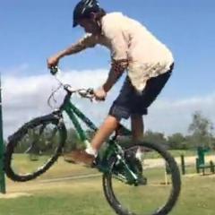
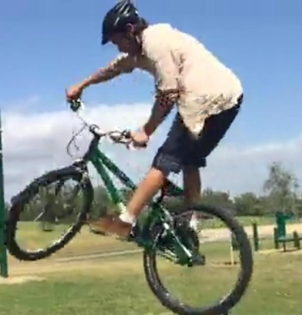
From the album: Heatsink
-
From the album: Heatsink
-
From the album: Heatsink
-
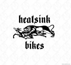
From the album: Heatsink
-
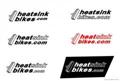
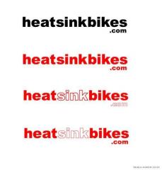
right just got home.... you want heatsink and www.heatsinkpads.com or bikes.com on it as well? Need t-shirt designs as well? Anything else?
-
is jimbo (james hyland) still riding? Only talked to hima few times since koxx days...sad he didn't have the funds to come out to usa this summer :ermm:
-
As others said...I would've maybe waited to get it all rolling. I've got a project going right now which has been in the works for over a month and you have to pay attention to every detail. I'm teaching myself flash for crying out loud... Not sure about t-shirts 1-4, nothing special about them. I do like #5, but you don't have any in stock? Might have at least wanted to wait for them to come in stock before announcing your product.
-
If this is open for a while I'd like to put some entries in. On vacation far away from my office until sunday night though :(
-
one color...means one color, and when you are printing things black = a color :) just an FYI for those working for this, I'm about to go on vacation in a few hourse but I basically do logos and other design work for a living. KISS = keep it simple stupid :) Work with a basic font that mr. heatsink likes and work around it.
-
There should be alot more replies to this vid...amazing riding! (Y) :D :P
-
(Y)
-
After a few weeks (or months for some people) of riding a frame you will get so used to it that a few mm differences in length or different angles don't really matter...One won't make you better than the other, they are both great frames and in the end you will ride either one just as well.
-
fantastic riding :blink:
-
Enjoyable shit m8; check it and smoke a fat spliff as you dig the tunes :P
-
you must realise that box was completely soaked and slippery as a whale :P
-
actually like it says if you want to PM me before you send out the final deals for print let me know...some things like kerning/leading and other spacing are often left out in the amateur designer. Many people won't notice it but it makes a huge difference. I really do enjoy that picture though; great concept.
-
Good job on the site, in terms of the "art" page just keep in mind it will be a bit expensive to do so many colors in the first t-shirt design...however the second t-shirt design I think is great- the one with the huge big covered in blood coming around it. My only suggestion would be to bring the IMPACT down a bit, like it is in the VERY bottom...in the above picture it is far too bold...in fact it is in a different typeface. Instead keep it the same type face as below (some sort of proper or old english font) and just keep impact bold. Otherwise it really doesn't work at all with that old english right next to an art deco/ bauhaus font. Your layout for the t-shirt is fantastic, really fine. your digital art is fun as well- the photoshoped one is fine...not sure where you are going with but it works well in terms of graphic interest. The illustrator picture (i'm assuming) doesn't work that well. I can see what you are trying to do with the right side of the picture but you don't pull it together. Bring in some ideas from your t-shirts into there- i see you've already tried to put in the whole blood splotting effect and tried to keep the composition with the ubrella but it doesn't work I'm afraid. Just trying to give positive feedback to a young designer- for your age you should really keep going at it..I'm 23 years old and recently graduated with a graphic design degree and a minor in art history, so I'm not trying to blow steam up your arse by any means. Just trying to help out- its my job and my life from now on.
-
fun, fun, FUN!
-
on the same note as big events in england... where are the sick nass videos? where are the sick bikeshow 05 videos?
-
just spray paint em :lol: thats all I did, its still mostly white after a year....